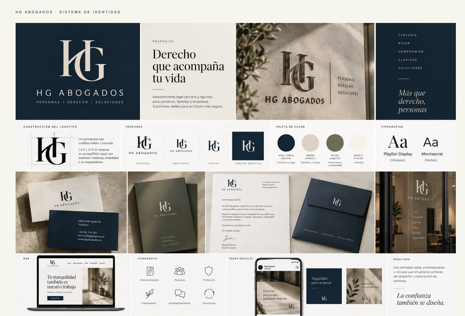
Legal rigour and strategic clarity expressed through an editorial identity.
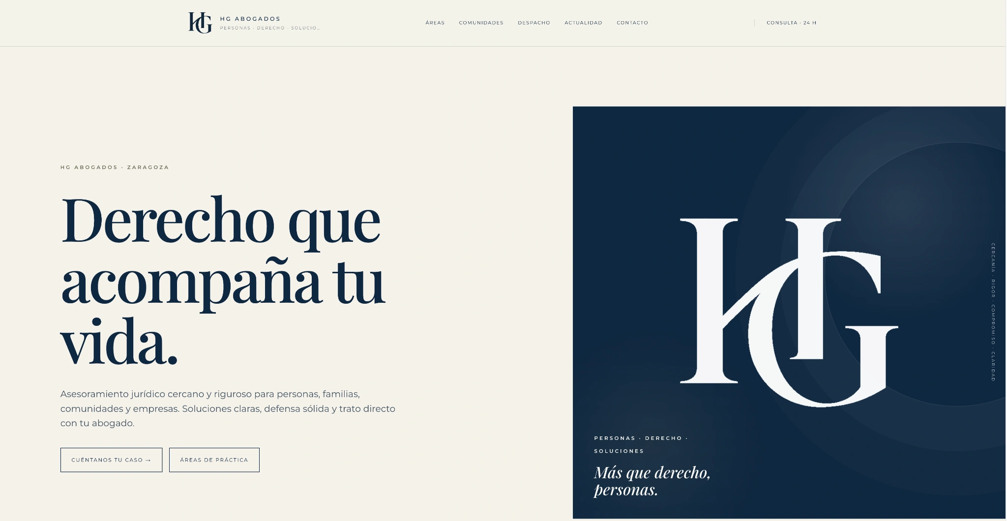
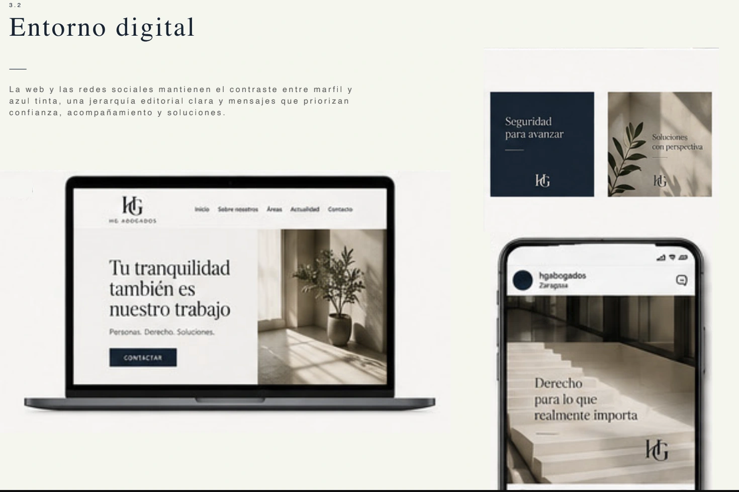
The website starts with a restrained editorial composition and an identity that is recognisable from the first encounter.
The project
Bringing clarity to complexity with precision.
A contemporary identity for a law firm that needed to convey rigour and experience through a less predictable visual language. The system centres on precision, structure and communication that makes complex matters understandable.
Co.’s contribution
Brand strategy, creative concept, monogram and logo, colour palette, typographic system, art direction, verbal identity, applications, brand guidelines and website proposal.
Scope
A visual system built on editorial contrast, a modular grid and a mineral palette. Applied to legal documentation, stationery, digital media, presentations and signage.
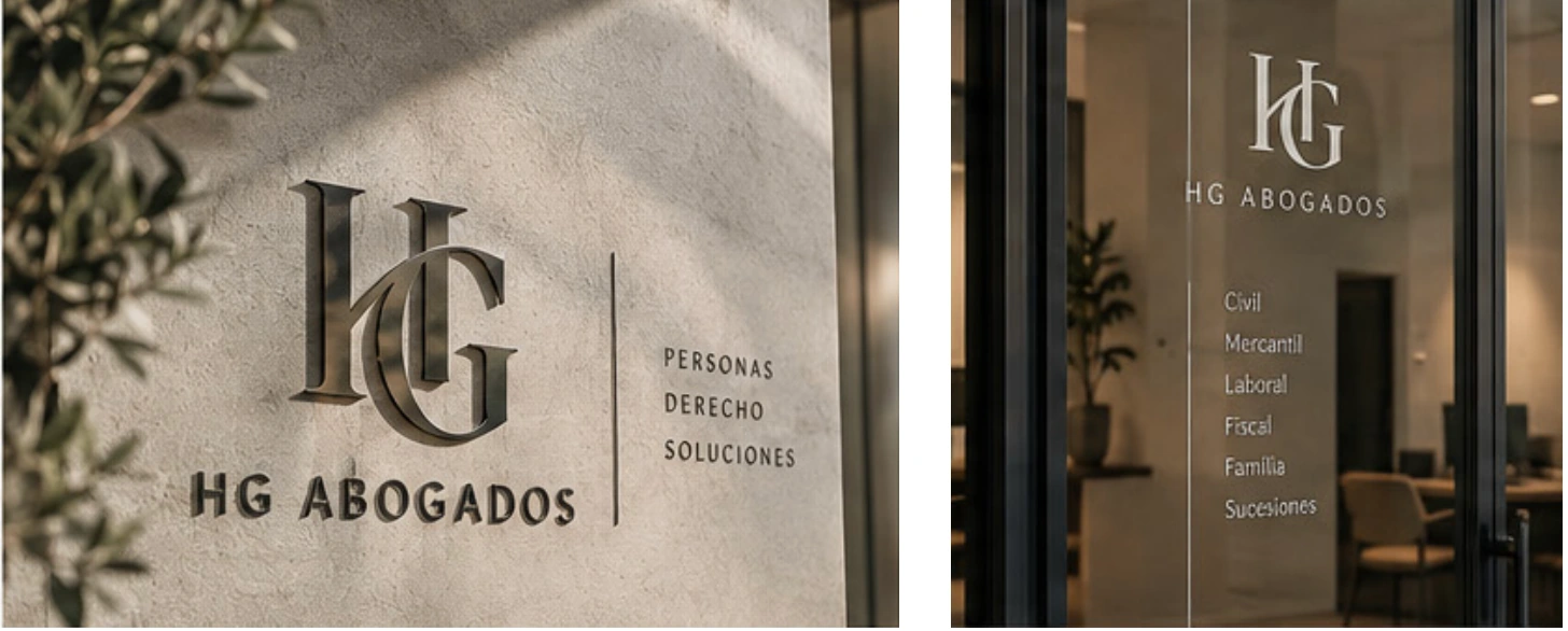
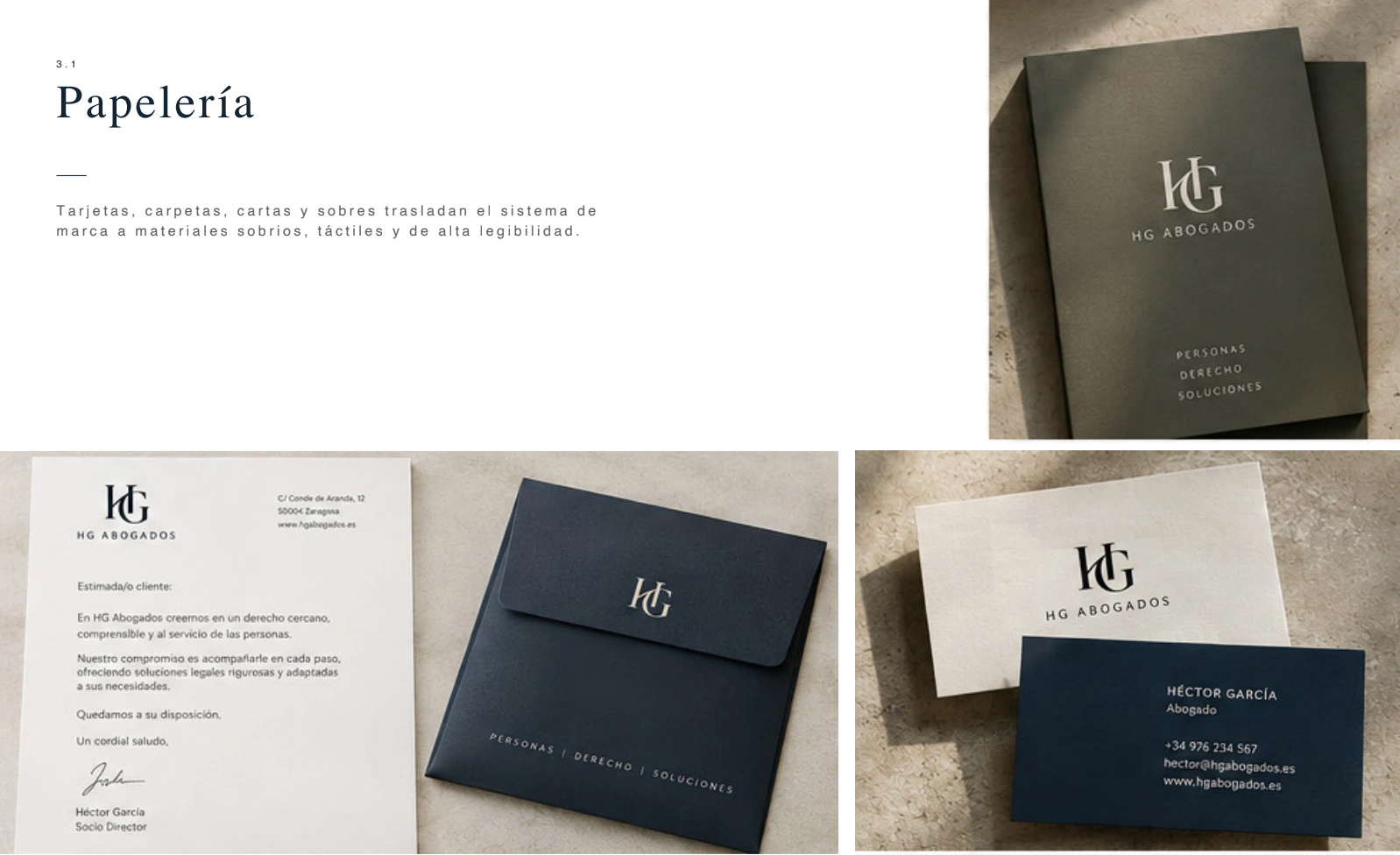
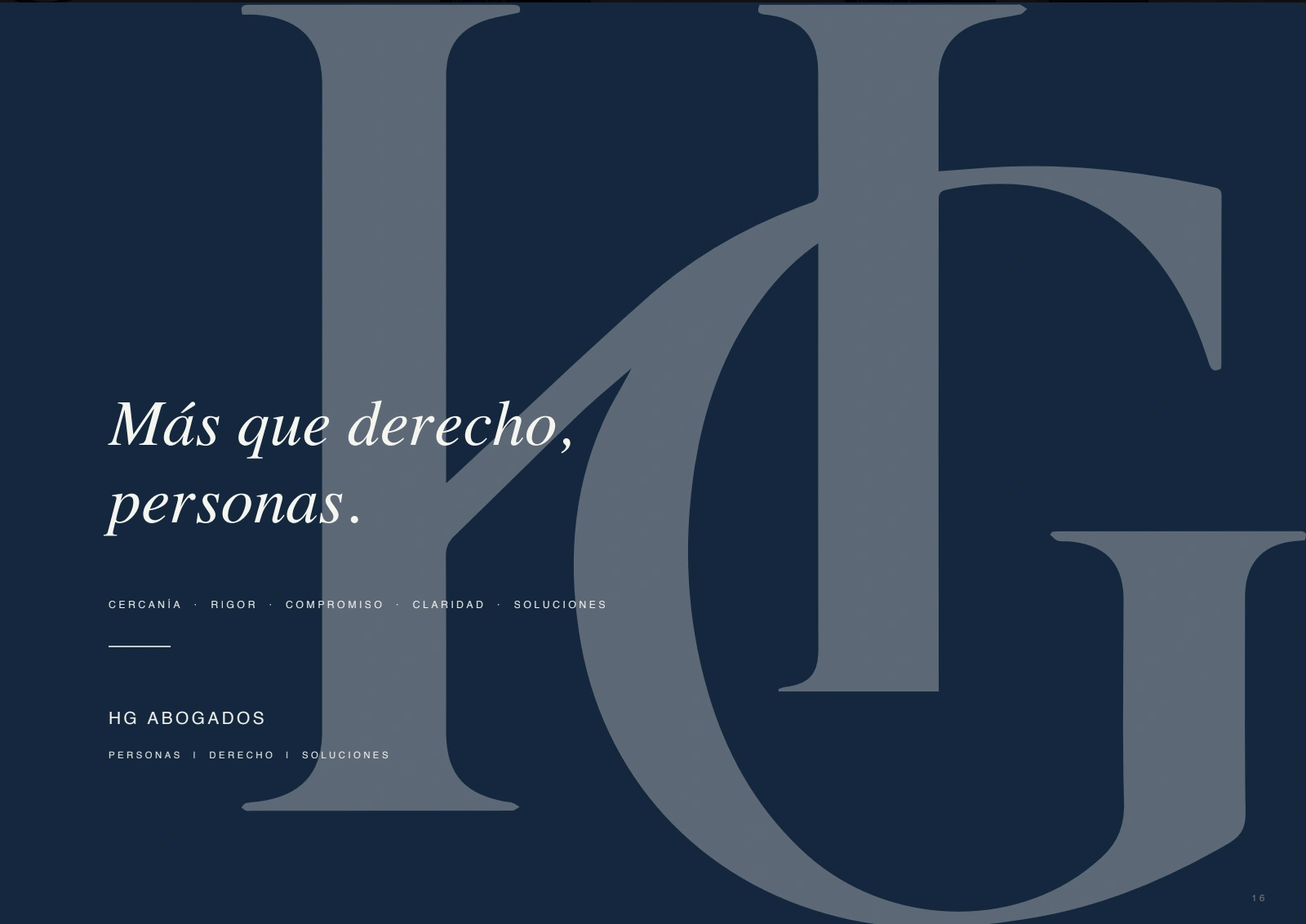
Complete identity system: monogram, editorial language, palette, applications and digital presence.The brand takes its place in the physical space through restraint, material choices and signage consistent with its positioning.Stationery designed as an extension of the system: understated materials, clear hierarchy and close attention to detail.The editorial language stays consistent across web, mobile and social communication.A conceptual piece that captures the brand’s tone: rigour, approachability and a less conventional voice for the sector.
Project by Co. · Branding, art direction, verbal identity and web · 2026.
We use necessary storage to remember your choice and, only if you accept, Google Analytics to understand visits and improve the website. You can change your choice at any time in the footer. Details in Cookie settings and the policies in the footer.