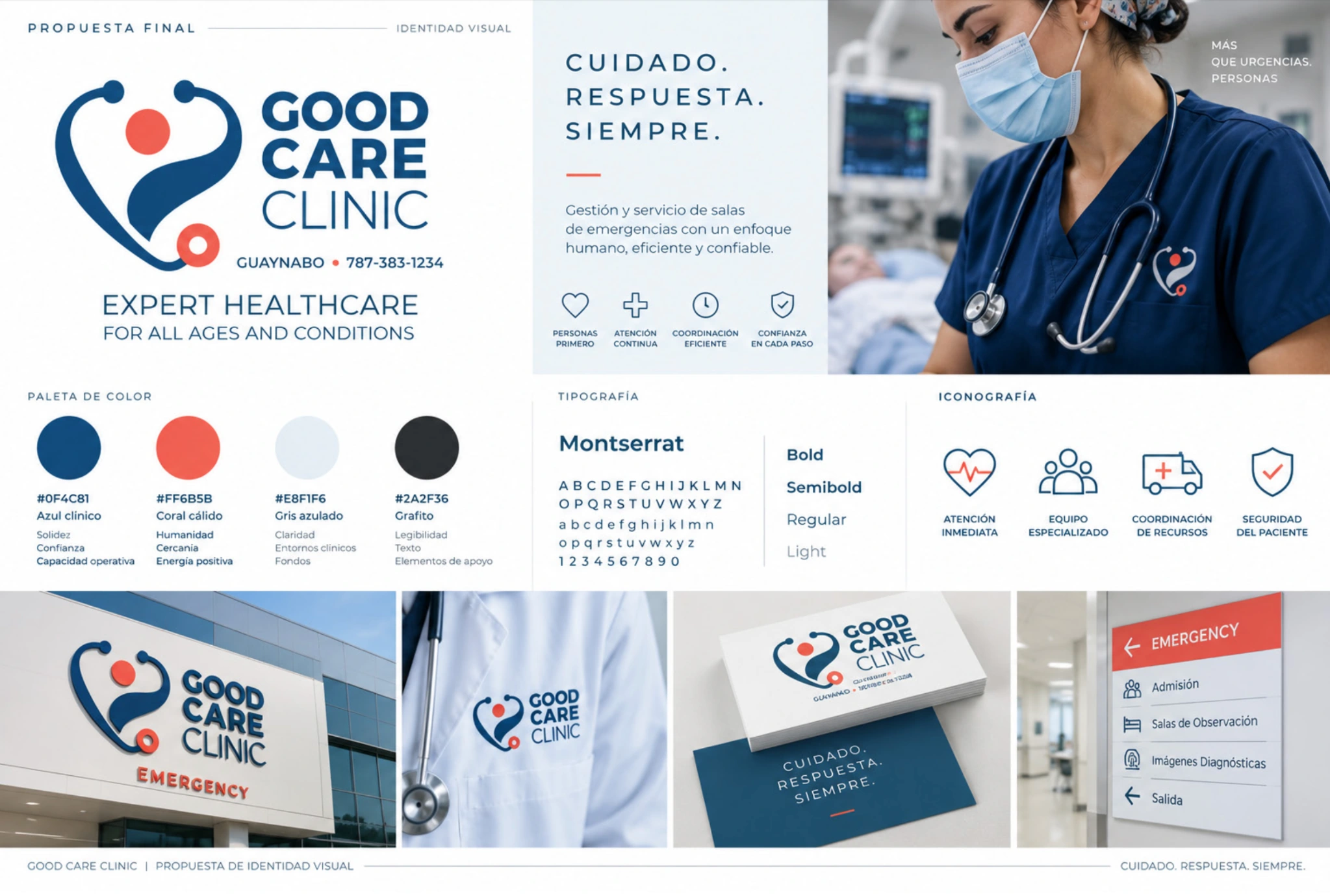
A clinical identity that turns care and responsiveness into a recognisable system.
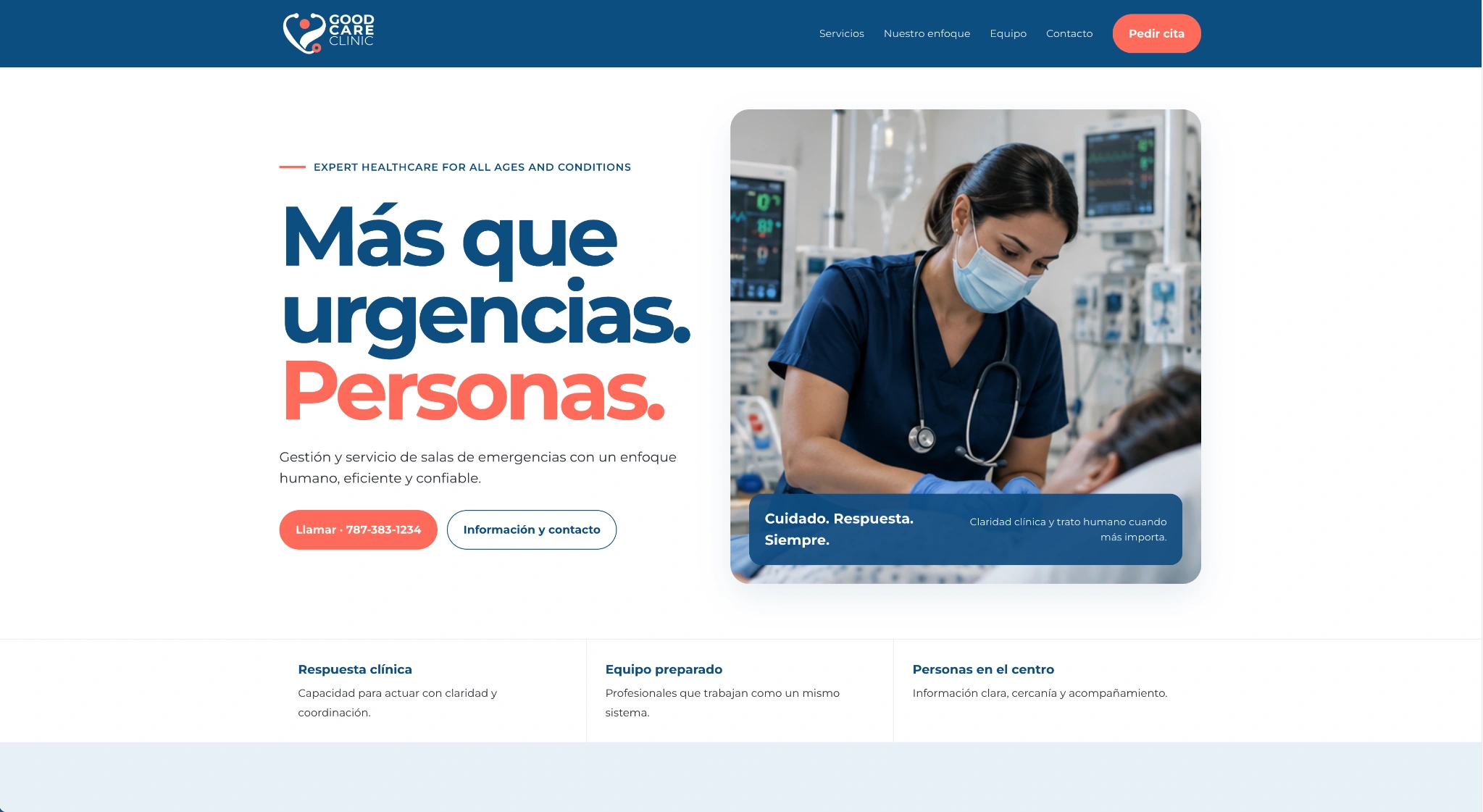
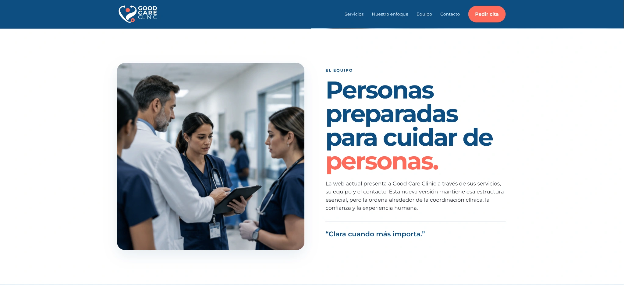
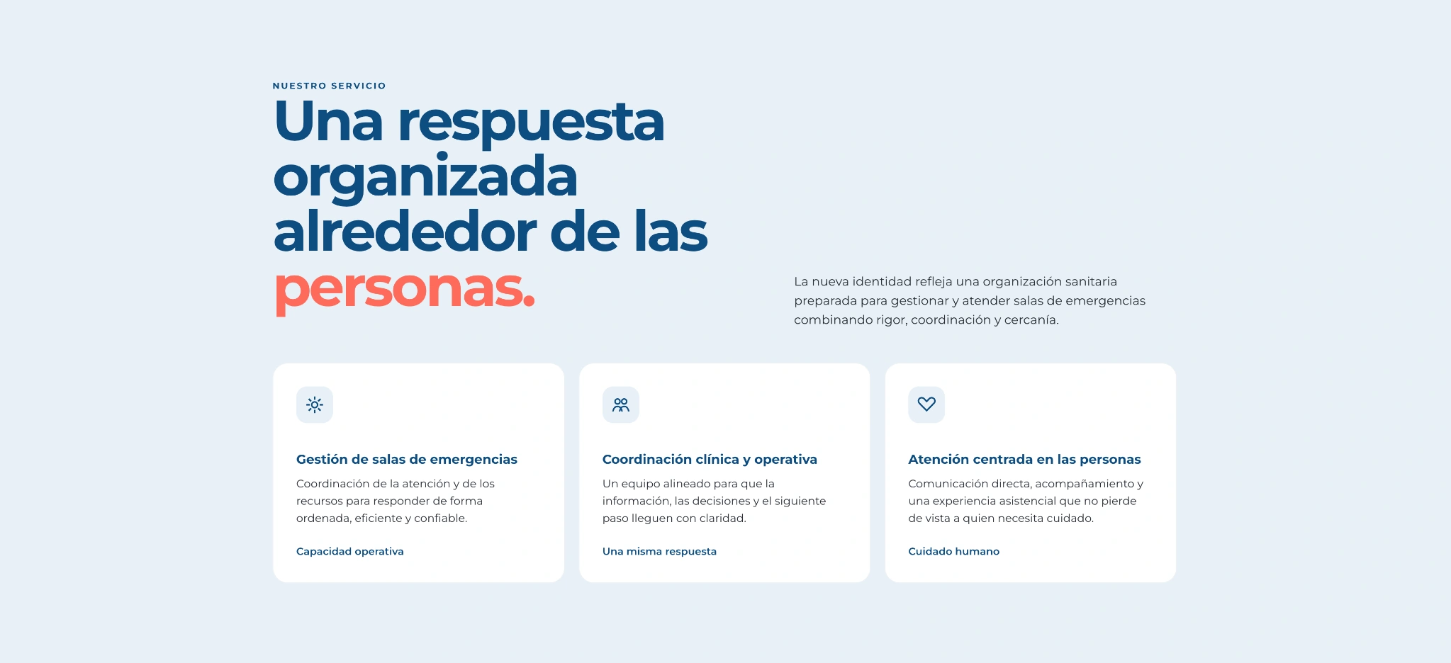
The new identity comes to life online: clinical clarity, a personal approach and a direct visual hierarchy.
The project
From a medical code to a human brand.
A complete identity redesign for Good Care Clinic, a company that manages and operates emergency departments. The challenge was to preserve the trust associated with clinical care while building a more human, clear and contemporary presence.
Co.’s contribution
Concept and visual strategy, logo redesign, colour system, typography, iconography, photographic direction, tone of voice, applications, brand guidelines and website redesign.
Scope
A system designed for signage, uniforms, clinical documentation, advertising, social media and digital use. Clinical blue provides structure, with warm coral as a human and functional accent.
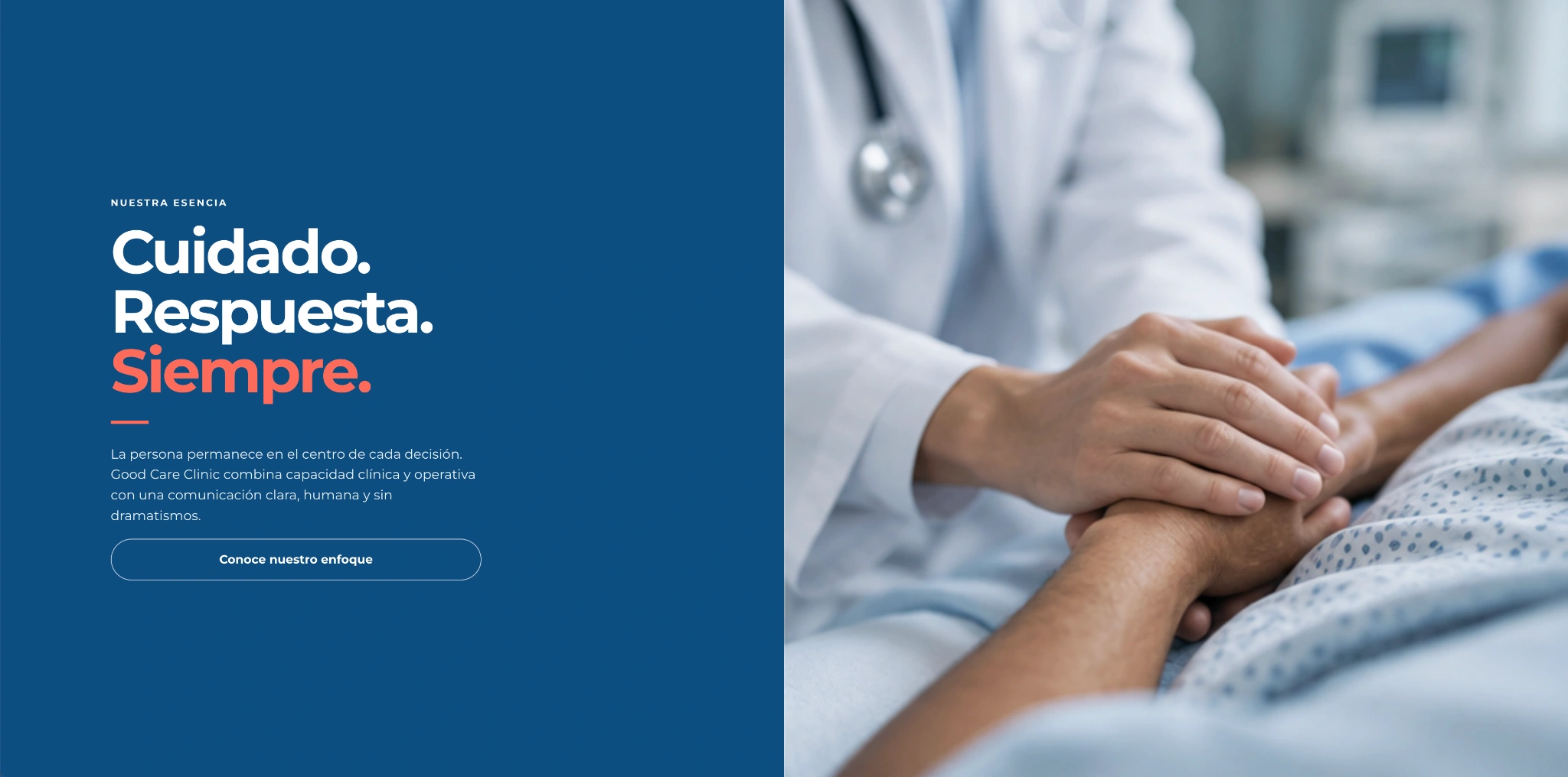
Identity system: a recognisable brand connecting clinical language with the human element.The verbal identity becomes a strong visual statement: Care. Response. Always.Photography and messaging work together to reinforce the human character without compromising clinical rigour.The content structure organises the value proposition and makes the service immediately clear.
Project by Co. · Visual identity, creative direction and web · 2026.
We use necessary storage to remember your choice and, only if you accept, Google Analytics to understand visits and improve the website. You can change your choice at any time in the footer. Details in Cookie settings and the policies in the footer.